a behind the scenes look into the extra nice visual branding development
ethos
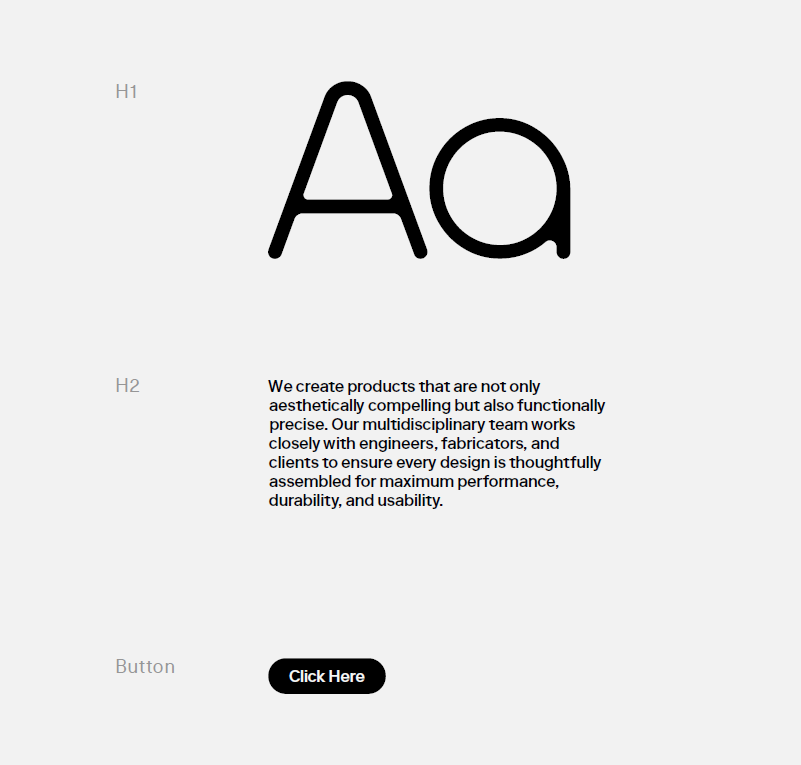
THIS DESIGN SYSTEM EMBODIES PRECISION AND EFFICIENCY, USING A RESTRAINED GREY COLOR PALETTE TO CONVEY NEUTRALITY. THE SIMPLISTIC TYPOGRAPHY, including a bespoke font family, ENHANCES READABILITY, FOCUSING ON CLEAR COMMUNICATION WITHOUT DISTRACTION. THIS CREATES A REFINED AND FUNCTIONAL AESTHETIC THAT PRIORITIsES FORM AND PURPOSE.
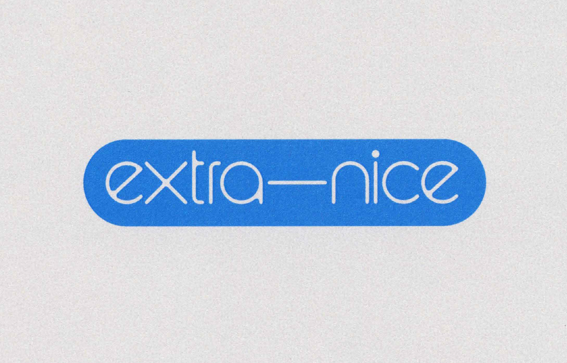
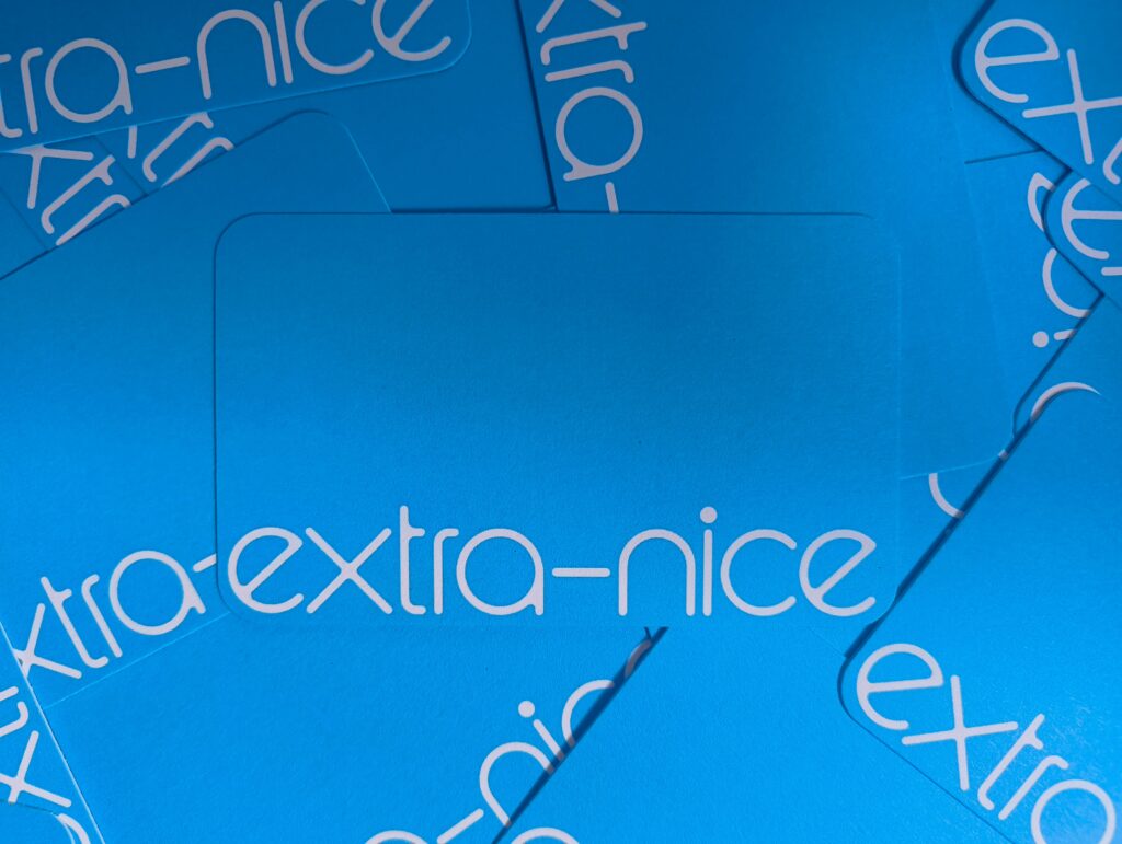
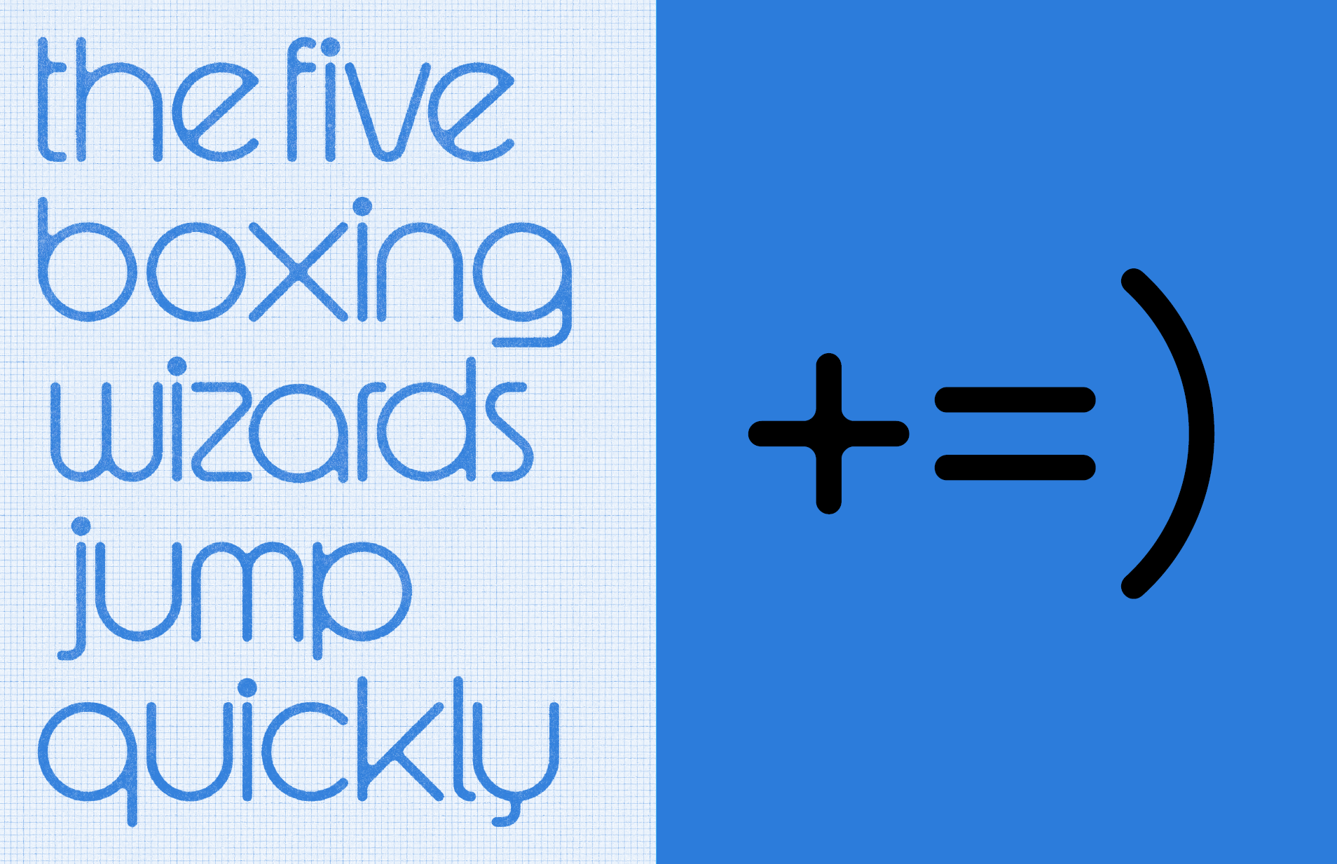
This design system pairs a cool but inviting blue and mechanically drawn letter forms. The geometric typography offers clean, modern readability and sense of playfulness. These elements create a harmonious balance of simplicity and personality, while still embracing and evoking a hand+machine crafted essence.
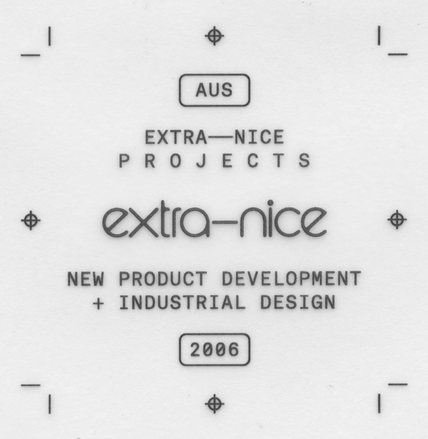
logo & powermark
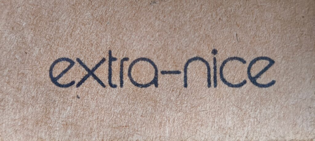
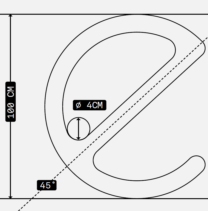
logo

powermark [show on screen social]

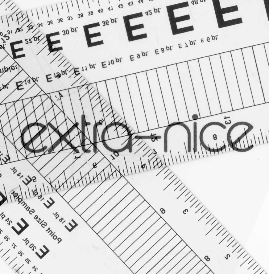
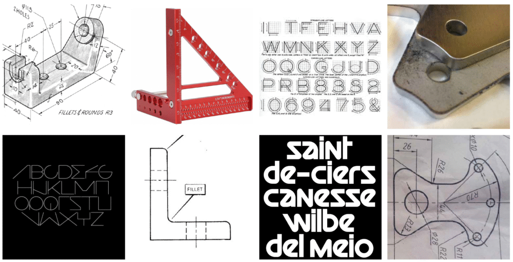
inspiration / background
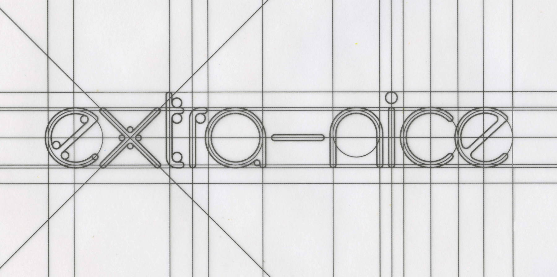
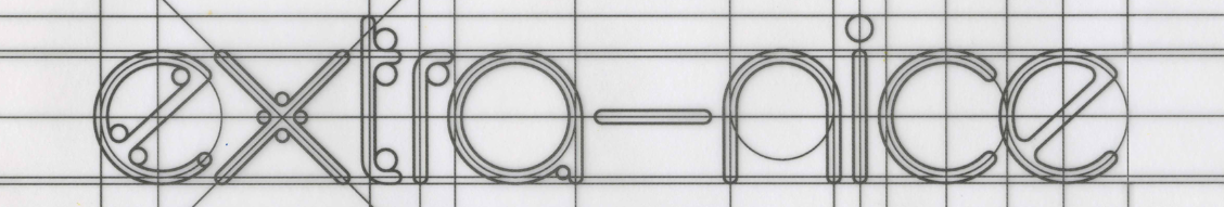
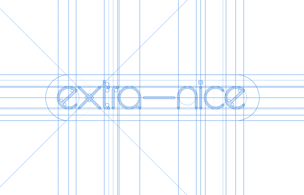
typography
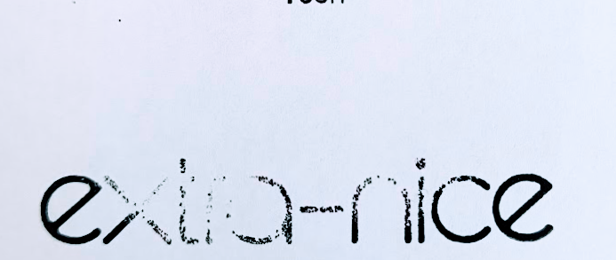
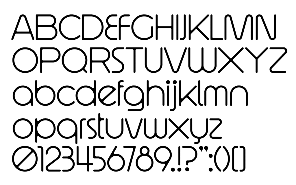
a custom font was created as well as a custom emoji to be used sparingly +:)
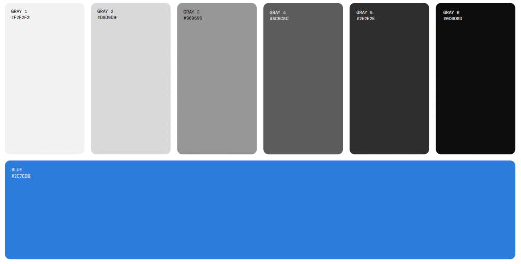
colour
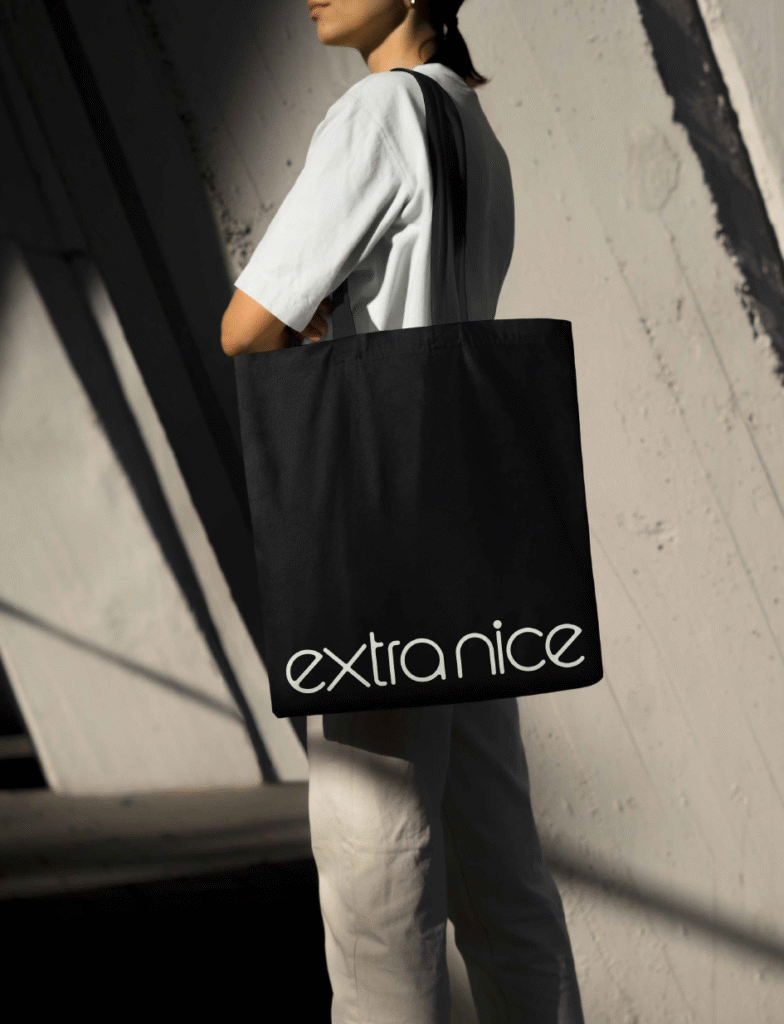
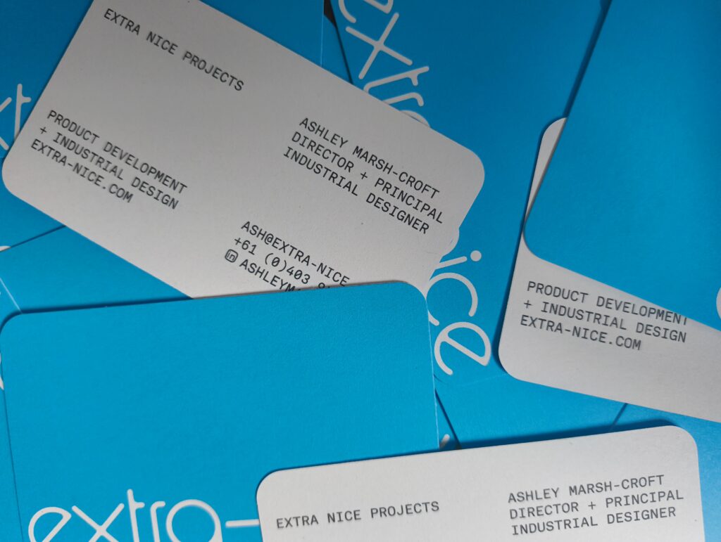
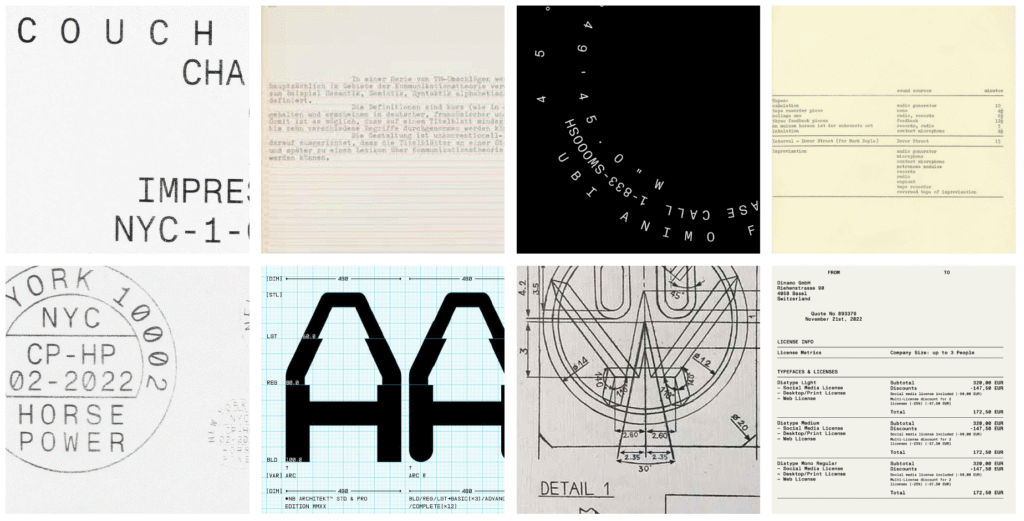
usages
business cards, document templates, website, print, stamps, T-shirts, Totes